ShopDreamUp AI ArtDreamUp
Deviation Actions


![[C] ShadowPlume](https://images-wixmp-ed30a86b8c4ca887773594c2.wixmp.com/f/eb17fcbb-ef27-428a-8de9-17e85572c3bb/daan1j1-31001b90-d5d0-40f9-9645-bece05bb5447.png/v1/crop/w_92,h_92,x_7,y_0,scl_0.028316405047707/_c__shadowplume_by_sketchychangeling_daan1j1-92s.png?token=eyJ0eXAiOiJKV1QiLCJhbGciOiJIUzI1NiJ9.eyJzdWIiOiJ1cm46YXBwOjdlMGQxODg5ODIyNjQzNzNhNWYwZDQxNWVhMGQyNmUwIiwiaXNzIjoidXJuOmFwcDo3ZTBkMTg4OTgyMjY0MzczYTVmMGQ0MTVlYTBkMjZlMCIsIm9iaiI6W1t7InBhdGgiOiJcL2ZcL2ViMTdmY2JiLWVmMjctNDI4YS04ZGU5LTE3ZTg1NTcyYzNiYlwvZGFhbjFqMS0zMTAwMWI5MC1kNWQwLTQwZjktOTY0NS1iZWNlMDViYjU0NDcucG5nIiwiaGVpZ2h0IjoiPD03NzkiLCJ3aWR0aCI6Ijw9MTAyNCJ9XV0sImF1ZCI6WyJ1cm46c2VydmljZTppbWFnZS53YXRlcm1hcmsiXSwid21rIjp7InBhdGgiOiJcL3dtXC9lYjE3ZmNiYi1lZjI3LTQyOGEtOGRlOS0xN2U4NTU3MmMzYmJcL3NrZXRjaHljaGFuZ2VsaW5nLTQucG5nIiwib3BhY2l0eSI6OTUsInByb3BvcnRpb25zIjowLjQ1LCJncmF2aXR5IjoiY2VudGVyIn19.T0WqmwcNVbXceVShqb4C5qjx0YPXry0TUbYuwahKRPA)


![[Comm.] Admiring the Arts](https://images-wixmp-ed30a86b8c4ca887773594c2.wixmp.com/f/eb17fcbb-ef27-428a-8de9-17e85572c3bb/darnsur-9808c938-ae0f-422b-ae68-34b7b02bd168.jpg/v1/crop/w_92,h_92,x_9,y_0,scl_0.019166666666667,q_70,strp/_comm___admiring_the_arts_by_sketchychangeling_darnsur-92s.jpg?token=eyJ0eXAiOiJKV1QiLCJhbGciOiJIUzI1NiJ9.eyJzdWIiOiJ1cm46YXBwOjdlMGQxODg5ODIyNjQzNzNhNWYwZDQxNWVhMGQyNmUwIiwiaXNzIjoidXJuOmFwcDo3ZTBkMTg4OTgyMjY0MzczYTVmMGQ0MTVlYTBkMjZlMCIsIm9iaiI6W1t7ImhlaWdodCI6Ijw9NzQ1IiwicGF0aCI6IlwvZlwvZWIxN2ZjYmItZWYyNy00MjhhLThkZTktMTdlODU1NzJjM2JiXC9kYXJuc3VyLTk4MDhjOTM4LWFlMGYtNDIyYi1hZTY4LTM0YjdiMDJiZDE2OC5qcGciLCJ3aWR0aCI6Ijw9MTAyNCJ9XV0sImF1ZCI6WyJ1cm46c2VydmljZTppbWFnZS5vcGVyYXRpb25zIl19.2rfxh_sKXic357dzBcPYguuRTIkHEfsIA2Qj5QogoLk)
Suggested Deviants


Suggested Collections


![Thorax and Luna (Celectial Advice\Season 7) [mlp]](https://images-wixmp-ed30a86b8c4ca887773594c2.wixmp.com/f/8b8d534c-fc03-498d-81f4-012215e7f728/db61u3k-060e9bd3-1d26-4908-86ae-dfc98ac5e3f7.jpg/v1/crop/w_184,h_184,x_36,y_0,scl_0.098290598290598,q_70,strp/thorax_and_luna__celectial_advice_season_7___mlp__by_tavifly_db61u3k-92s-2x.jpg?token=eyJ0eXAiOiJKV1QiLCJhbGciOiJIUzI1NiJ9.eyJzdWIiOiJ1cm46YXBwOjdlMGQxODg5ODIyNjQzNzNhNWYwZDQxNWVhMGQyNmUwIiwiaXNzIjoidXJuOmFwcDo3ZTBkMTg4OTgyMjY0MzczYTVmMGQ0MTVlYTBkMjZlMCIsIm9iaiI6W1t7ImhlaWdodCI6Ijw9OTAwIiwicGF0aCI6IlwvZlwvOGI4ZDUzNGMtZmMwMy00OThkLTgxZjQtMDEyMjE1ZTdmNzI4XC9kYjYxdTNrLTA2MGU5YmQzLTFkMjYtNDkwOC04NmFlLWRmYzk4YWM1ZTNmNy5qcGciLCJ3aWR0aCI6Ijw9MTYwMCJ9XV0sImF1ZCI6WyJ1cm46c2VydmljZTppbWFnZS5vcGVyYXRpb25zIl19.JjKSTT-DwpkCEfgccPaxfFCenf1dUr8M4WvzSTOGjmg)
![Thorax and Luna (Celectial Advice\Season 7) [mlp]](https://images-wixmp-ed30a86b8c4ca887773594c2.wixmp.com/f/8b8d534c-fc03-498d-81f4-012215e7f728/db61u3k-060e9bd3-1d26-4908-86ae-dfc98ac5e3f7.jpg/v1/crop/w_92,h_92,x_18,y_0,scl_0.049145299145299,q_70,strp/thorax_and_luna__celectial_advice_season_7___mlp__by_tavifly_db61u3k-92s.jpg?token=eyJ0eXAiOiJKV1QiLCJhbGciOiJIUzI1NiJ9.eyJzdWIiOiJ1cm46YXBwOjdlMGQxODg5ODIyNjQzNzNhNWYwZDQxNWVhMGQyNmUwIiwiaXNzIjoidXJuOmFwcDo3ZTBkMTg4OTgyMjY0MzczYTVmMGQ0MTVlYTBkMjZlMCIsIm9iaiI6W1t7ImhlaWdodCI6Ijw9OTAwIiwicGF0aCI6IlwvZlwvOGI4ZDUzNGMtZmMwMy00OThkLTgxZjQtMDEyMjE1ZTdmNzI4XC9kYjYxdTNrLTA2MGU5YmQzLTFkMjYtNDkwOC04NmFlLWRmYzk4YWM1ZTNmNy5qcGciLCJ3aWR0aCI6Ijw9MTYwMCJ9XV0sImF1ZCI6WyJ1cm46c2VydmljZTppbWFnZS5vcGVyYXRpb25zIl19.JjKSTT-DwpkCEfgccPaxfFCenf1dUr8M4WvzSTOGjmg)


You Might Like…


Featured in Groups


Description
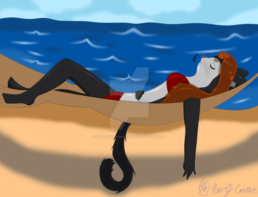
The colored version of my second summer drawing this year. Looks much better now, but I messed up on Carmen's arm and I didn't realize it until I was done.
Pencil Version: [link]
Pencil Version: [link]
Image size
4208x3216px 2.1 MB
Make
EASTMAN KODAK COMPANY
Model
KODAK EASYSHARE Camera, M522
Shutter Speed
1/8 second
Aperture
F/5.0
Focal Length
20 mm
ISO Speed
237
Date Taken
Jun 30, 2012, 12:19:35 PM
© 2012 - 2024 SketchyChangeling
Comments14
Join the community to add your comment. Already a deviant? Log In
Cute. The one thing that stands out to me though is the water; it stays a pretty strong blue throughout. If you had it's colors desaturate into a shade closer to the sky color as it faded away, it would give some atmospheric perspective, and not be as dominant an element on the page as it is now. The viewers attention should be primarily on Carmen, 'cause it's the best thing there.